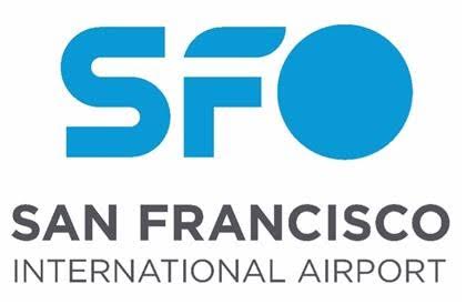
The New Logo for San Francisco International Airport Reflects Innovation and Heritage
San Francisco International Airport (SFO) has introduced a new logo and brand identity, marking a significant update after 24 years of using the “flight lines” logo. This change aligns with the airport’s ongoing efforts to modernize and enhance the passenger experience while celebrating the city’s rich history and innovative spirit.
Airport Director Ivar C. Satero expressed excitement about the new design, stating, “Much like our old logo marked a period of time in the early 21st century, the new logo shows our commitment to deliver an airport experience where people and our planet come first.”
The new logo, featuring elements that symbolize SFO’s history, present dynamism, and future potential, is highlighted by a color known as SFO Golden Hour Blue. This color pays tribute to the past while embracing a brighter, more vibrant future. The logo also reflects SFO’s new vision, “Inspiring the Extraordinary,” and mission to prioritize both people and the planet in the airport experience.
This branding overhaul was the result of an 18-month process involving market research and creative development. The new digital-first design ensures optimal visibility across various devices and screen sizes, with a flexible structure to adapt to different messages.
The logo will be gradually implemented, starting with digital platforms, followed by uniforms, buses, and other physical items over the next few years.
Read more at TravelMail | Follow us on Facebook | Twitter | and Instagram for on-the-go news

